Theory of relativity in data: making complex metrics look simple
This might seem bananas to you, yet it’s real: as a radically transparent enterprise, Dodo Brands makes its sales data totally open to the public.
You can study the entire network’s metrics — or dive deep into the performance of any of the company’s 700+ foodservice locations across 15 countries. Dodo’s management strongly believes that openness…
- builds trust for partners (prospective franchisees);
- provides more security for potential investors;
- encourages benchmarking across the chain and ultimately improves performance.
This premise posed a challenge for the team responsible for the development of Dodo’s corporate website: how to leverage transparency and make troves of data accessible for users with different agendas, knowledge, and backgrounds?
Lost in data: what research revealed
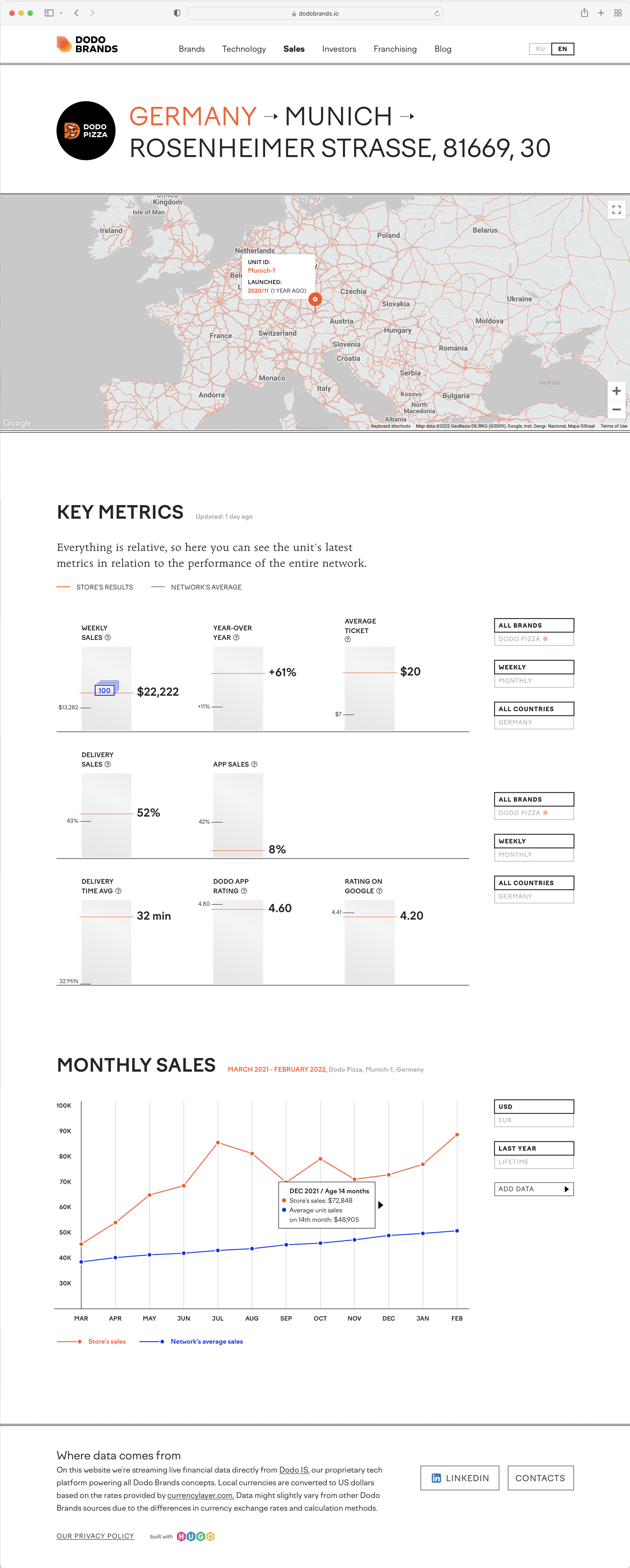
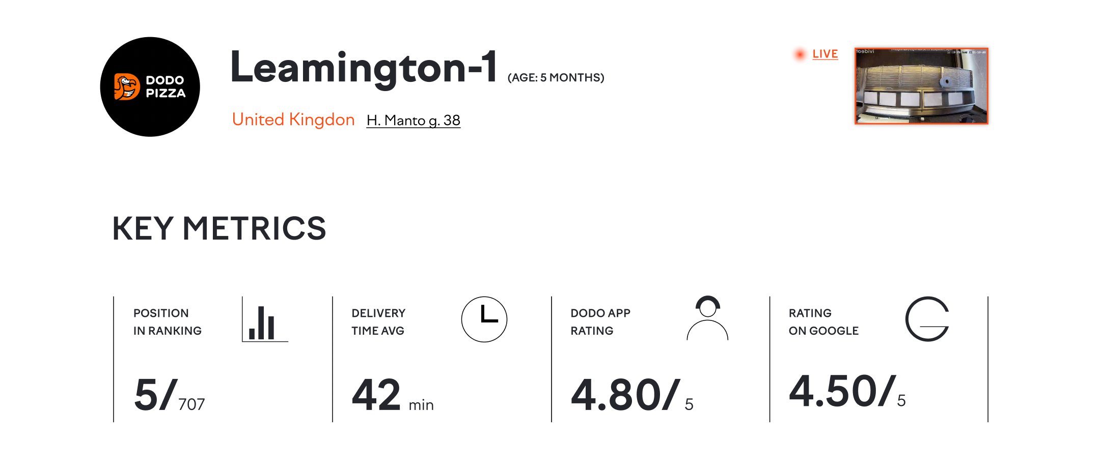
Every unit in the network — be it a pizza place, a coffee shop, or a doner kebab joint — has a dedicated page on the website. Since sales are processed by Dodo’s proprietary tech platform, this enables streaming key data right on the website via APIs.
User research revealed a few issues with the way the data was presented in the website’s initial version.
-
Users need context to interpret data. 27-minute delivery — is it good or bad? The answer depends on the context. If the network’s average is 35 minutes, a 27-minute delivery seems impressive — and not so much when most of the units deliver orders in under 25 minutes.
-
Users tend to get lost in the abundance of numbers. The initial spreadsheet-like visualization didn’t provide enough stimulus to guide users’ attention and differentiate between key and secondary metrics.
-
As a result, the page provided enough value neither for experienced users (too little actionable data) nor for the users browsing the website for the first time (too many metrics, easy to get lost).
Putting numbers in a broader context
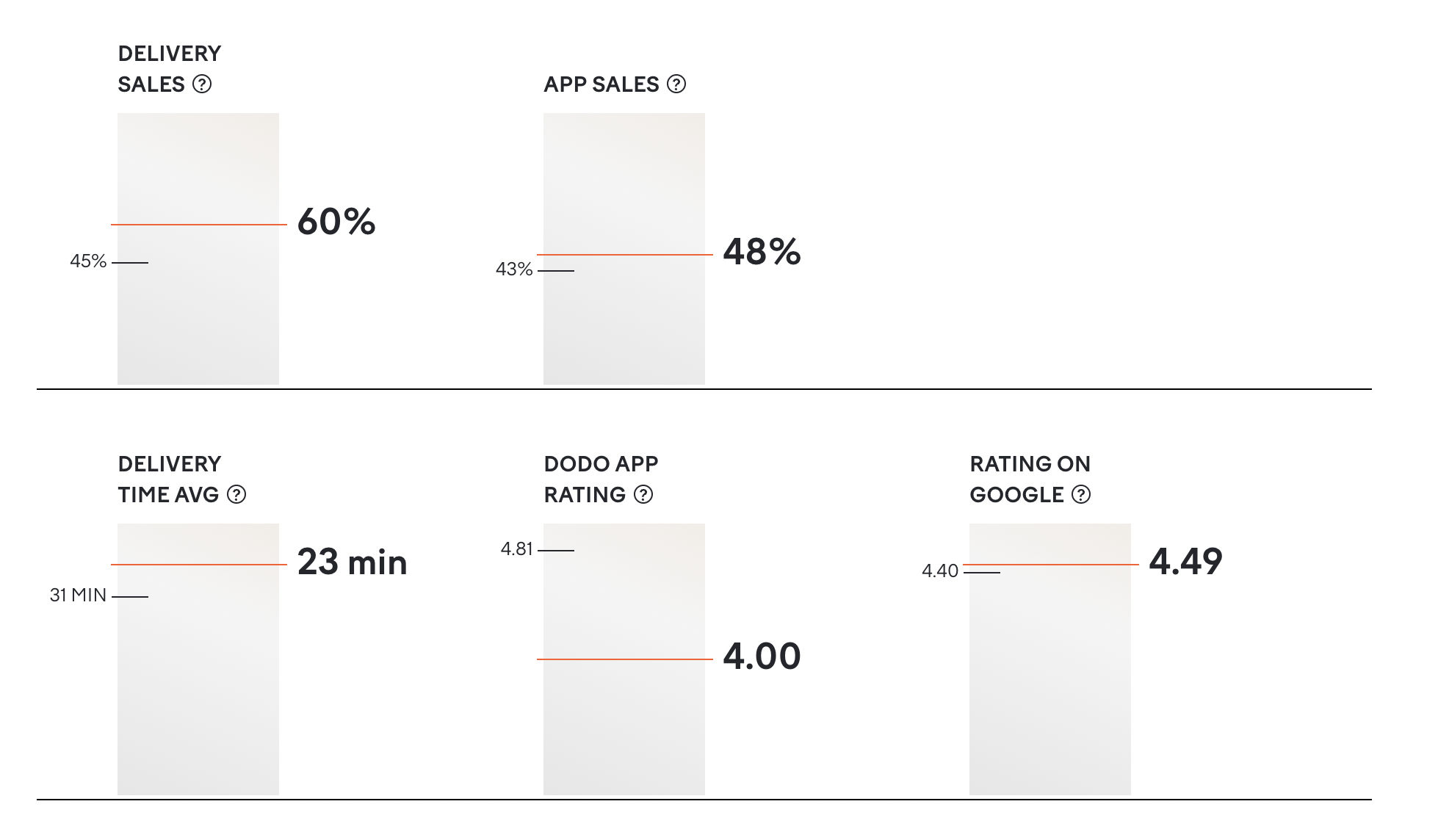
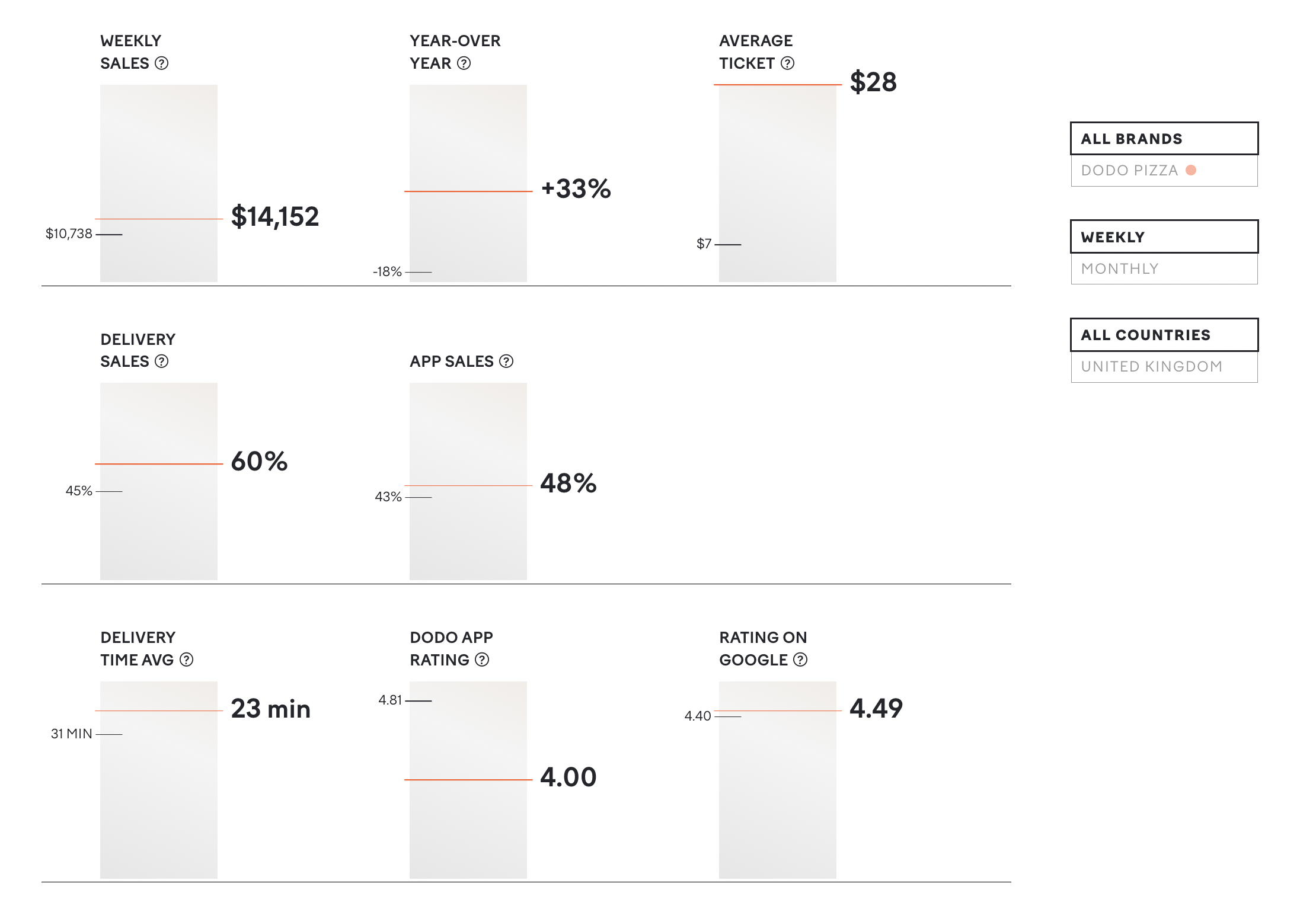
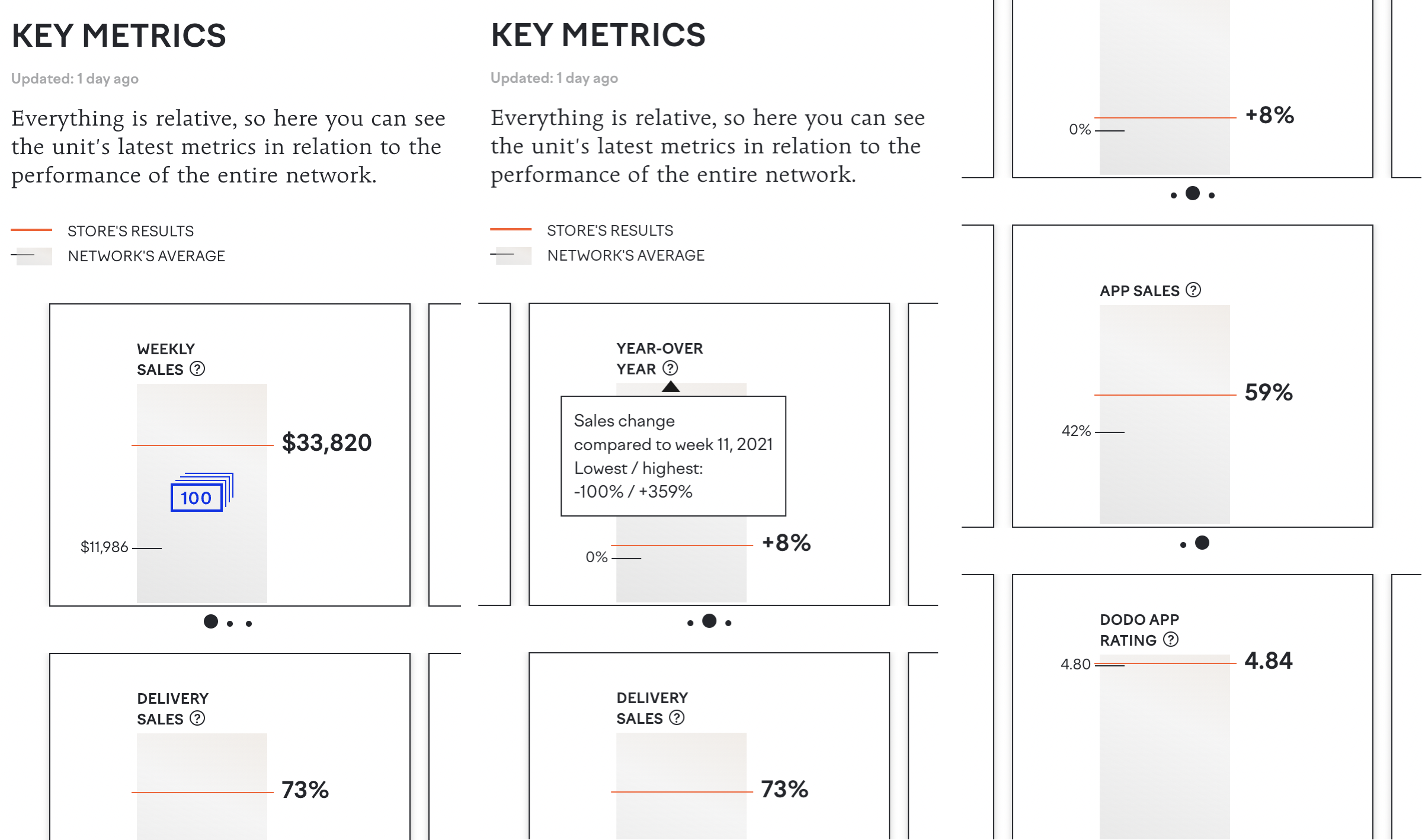
The first step the team made was to combine the unit’s metrics and network averages in one graph — and put them on a vertical bar relatively to their place on the possible range of values.
The unit’s metrics are represented by the red lines, while the gray lines represent averages.
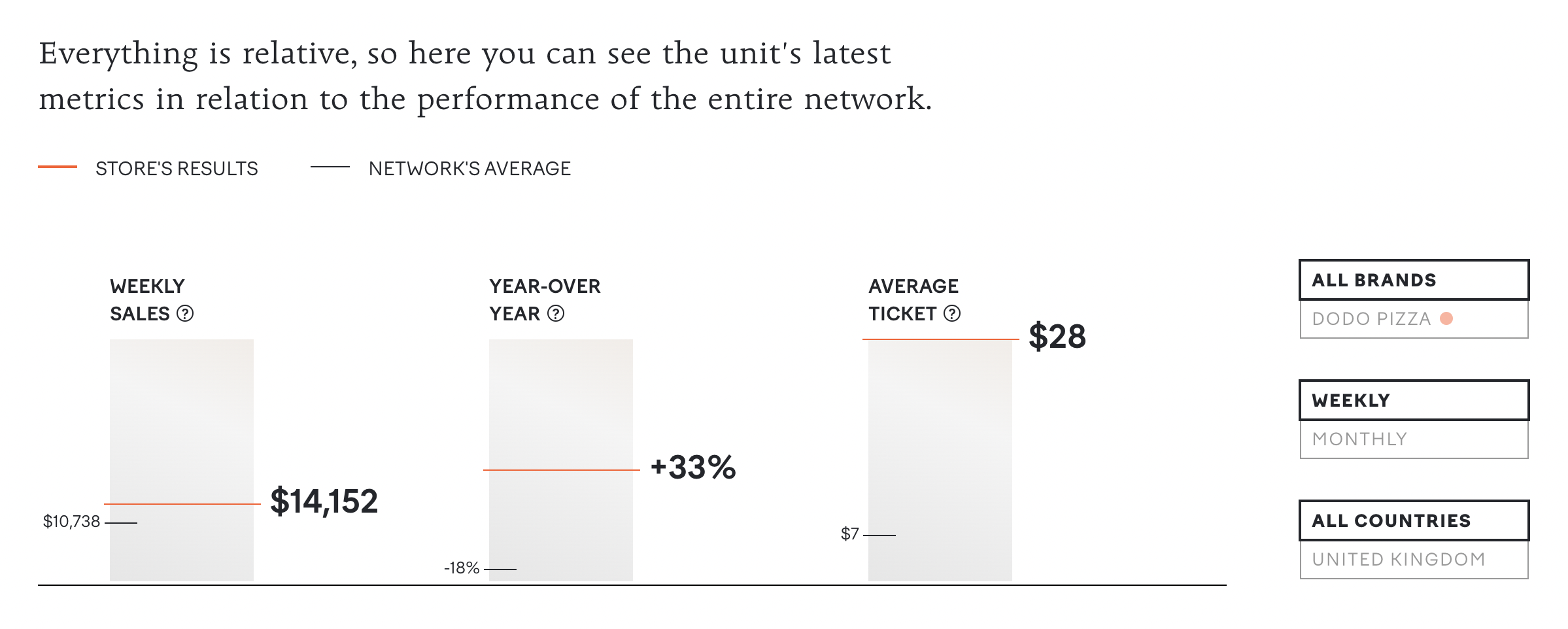
In this example, it’s relatively easy to notice that the unit in question performs better than the average across all metrics — and that in terms of average ticket, it lands at the very top of the range.
This approach also allowed the team to introduce a new feature for the power users: like using filters to change the context (see averages for a specific country or the brand in question).
Getting rid of complexity
The next important step was to make a rather radical decision to use the same UI for every metric on the page. This entailed challenging some norms and industry conventions.
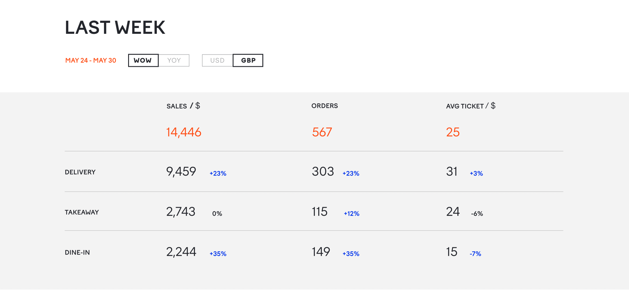
For example, traditionally, foodservice companies differentiate sales in dine-in, takeaway, and delivery. A conventional “pie” diagram would be a safe choice in this case.
In reality, the difference between dine-in and takeaway sales is insignificant, and % of delivery sales appears to be the most important for the financial assessment. And that’s exactly what UI reveals.
The same logic is applied to the sales channels. Instead of breaking them down by possible sources (contact center, website, app, register/cashdesk), the page focuses on the most significant one in the digital age: % of app sales.
Using just one type of visualization also reduces cognitive load. Once a user figures out how the interface is designed, reading data becomes extremely easy.
Details matter: polishing the interface
The team made a few smaller decisions to improve UX/UI.
-
There is value in showing the precise range of a metric, especially for power users. They can access them by hovering over the “?” signs. This way, these additional data don’t clutter the main interface.
-
The layout allows having different numbers of bars in every row. This gives flexibility, making it easy to add or remove new data in the future.
-
Showing data on mobile is always challenging due to the limited size of the screens. The team found a solution in turning every bar into a separate card. Cards are grouped together in a slider element.
The result
After internal testing, the design went into production, and the new version of the unit page was launched in Spring 2022. See it live at dodobrands.io.