Simple and scalable: design code for a hardware wallet
Hito happened to be a bit late to the party. In 2022, the market of hardware crypto wallets was already full of competitors. Ledger, Trezor, CoolWallet and others had been around for some time. Yet Hito's founder saw an opportunity in offering a wallet that would be not just secure but also user-friendly — a gadget that could be used by anyone, not just crypto enthusiasts.
For a team working on Hito's initial design code, this premise offered a challeging task. The goals were grand:
- to help the new brand stand out in the competitive envoironment;
- to communicate Hito's distinct values and key advantages;
- to be scalable across different mediums (web, app interfaces, packaging, etc.).
At the same time there were significant constrains: all this had to be achieved with the very limited resources of an early stage startup.
Mapping the world of crypto
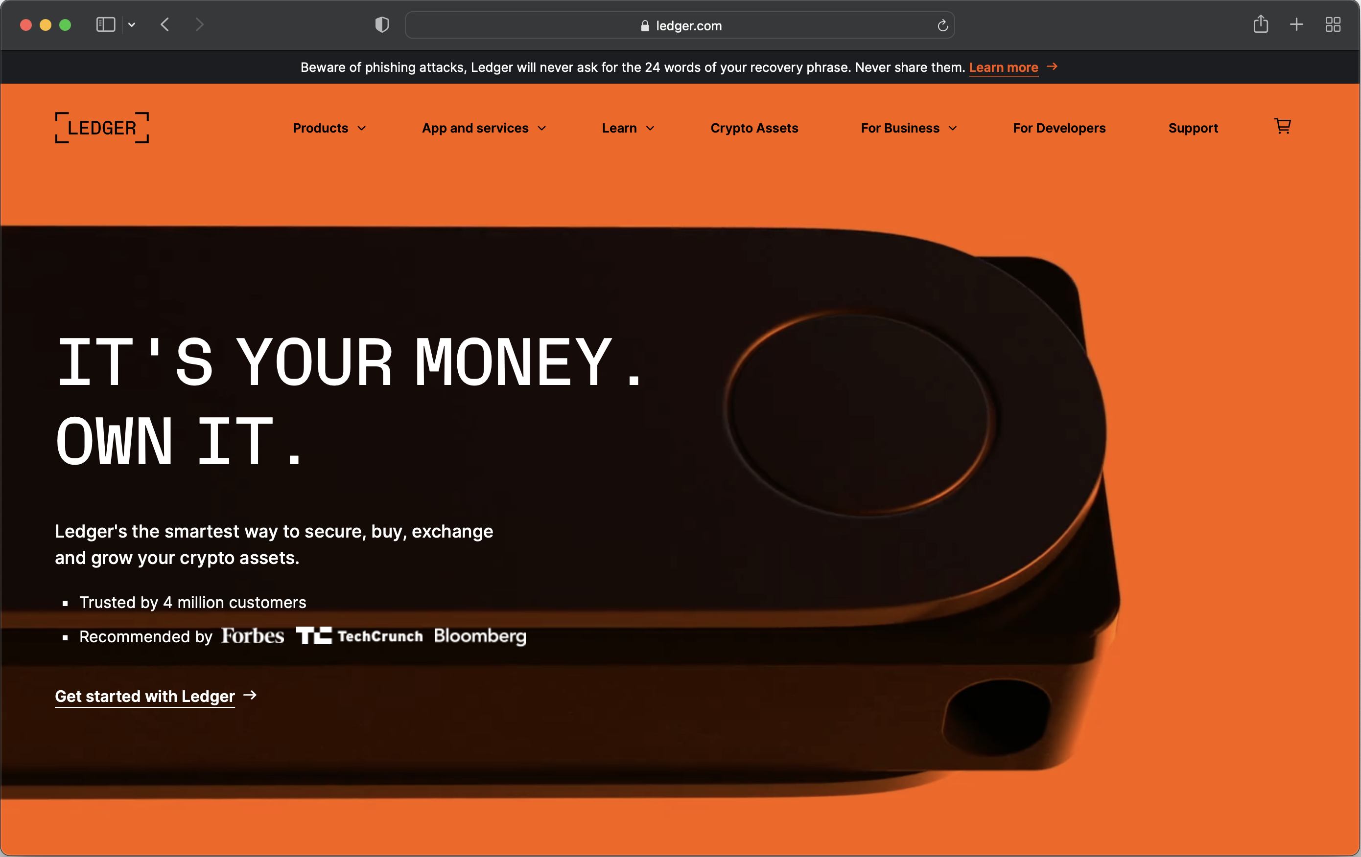
To better understand the context, the team studied all the existing crypto wallets, crypto projects in general, banks and financial institutions.
3 key trends were observed:
-
The crypto ecosystem didn't have any shared and disctinctive style.
-
At the same time, crypto wallets often copied Apple trying to present themselves stylish, polished, and premium.
-
Forward-thinking banks and financial projects wanted to appear more accessible and colorful (NatWest or Apple Card).

Talking to crypto enthusiasts
The team also conducted a number of interviews to better understand the targed audience and to identify the messages that would resonate most. Here are the key takeaways:
- Even crypto enthusiasts had a hard time understanding all the details of how crypto technologies worked;
- At the same time, security of crypto assets was a big concern for everyone;
- None of the existing hard wallets were really suitable for storing valuable NFTs for the lack of a screen on which NFTs could be seen;
- There was a significant audience eager to try new things even if practical implementations weren't even clear.
Identifying Hito's personality
Based on customer interviews, the team identified 5 key messages for Hito.
- Like other hardware wallets, Hito is secure.
- Unlike other hardware wallets, Hito is extremely easy to set up and use.
- Unlike other hardware wallets, Hito has a full-color touch screen which is perfect for NFTs.
- Unlike other hardware wallets, Hito is compact — almost the size of a credit card.
- Also, Hito is built by crypto enthusiasts.
Overall, the brand had to appear user-friendly, approachable, not dead serious and corporate but community-driven and maybe even a bit humorous.
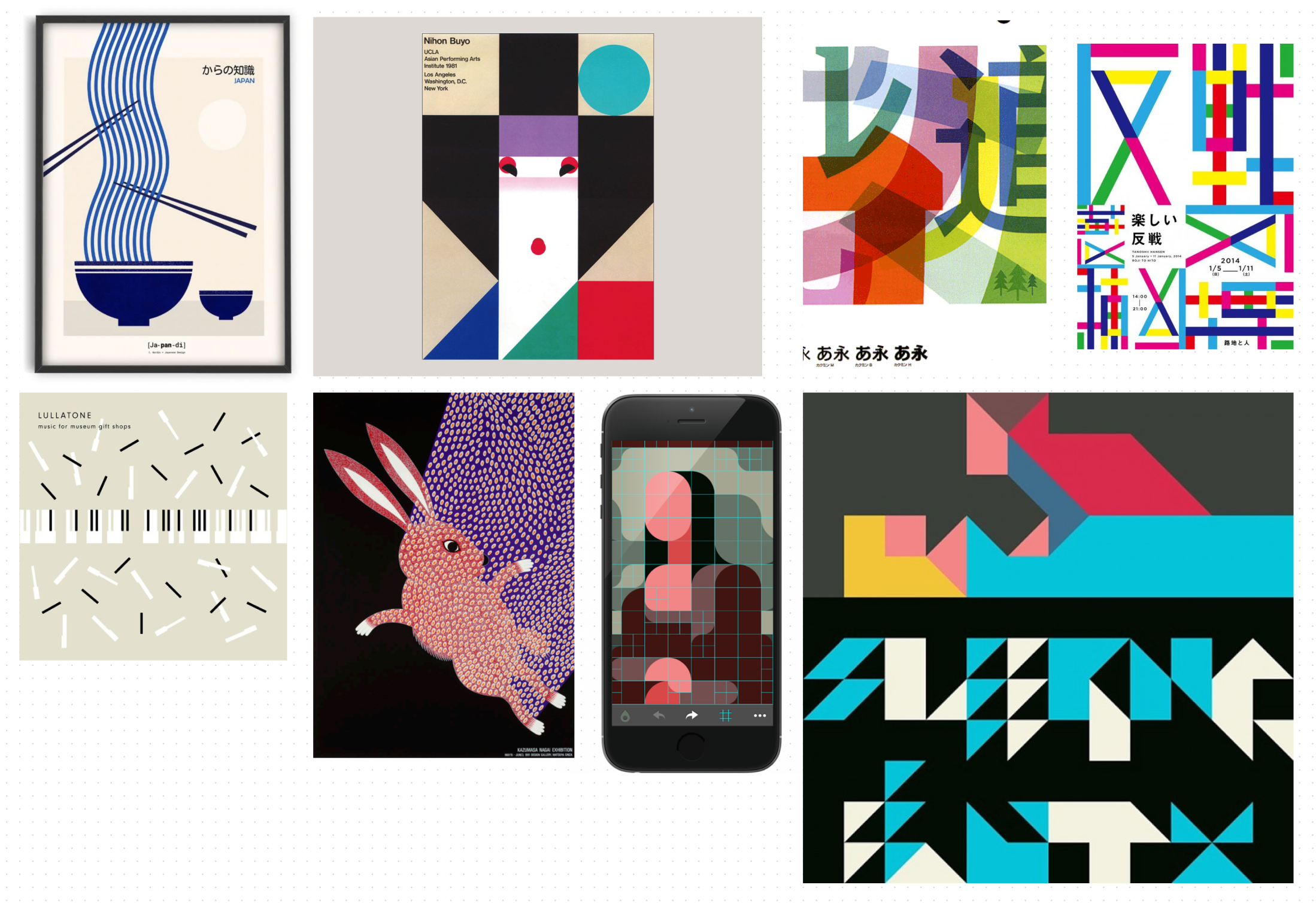
Since "hito" itself was a Japaneese word (meaning "person") and clearly conveyed references to Japan, even for English-speaking people, using Japan as a style reference was a viable option.

Defyning the tone of voice
The team defined that in order to sound not "corporate", the brand should not only be straightforward, laconic and down-to-earth, but also a bit ironic. This approach resulted in adding a bit of humor to the copy, like in the following sentences:
- You don’t need a ten-page manual to know how to protect your crypto assets.
- You can check the details of every transaction you sign — and actually see all the (very precious) NFTs you store.
- This wallet fits into a wallet — it’s a gadget the size of a credit card. For your inner nerd, here are the exact dimensions: 82.5x52x4mm.
- Everyone — even your Granny or that friend of yours who’s still on Skype — should be comfortable with a cold crypto wallet.
The final result
It took a few design iterations to nail the right style — simple, unique, and scalable.

A few features are worth mentioning:
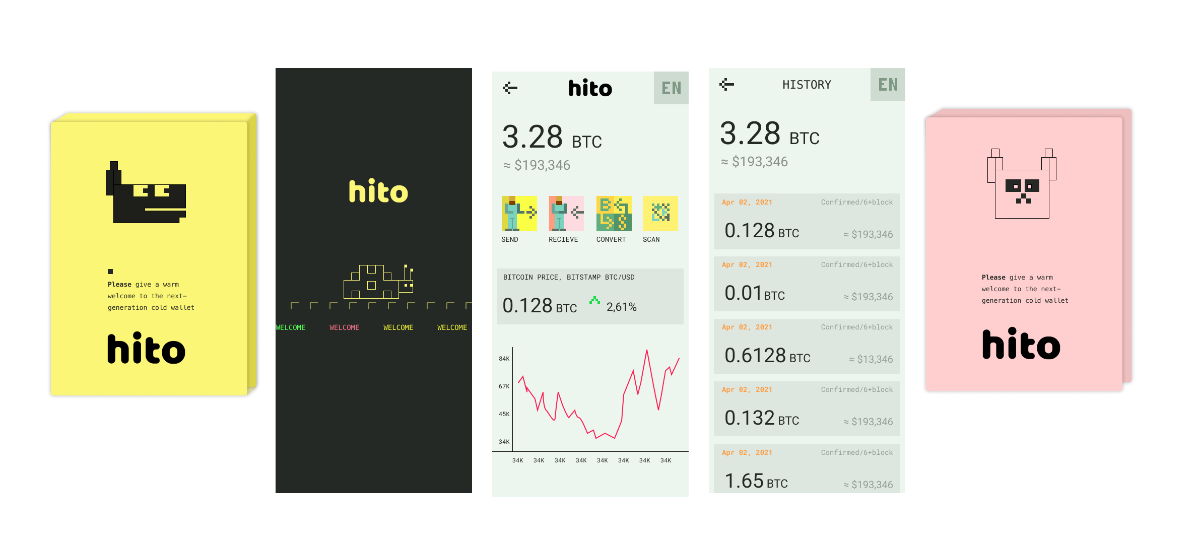
- The design is clearly inspired by pixel art that resonates with the target audience but it manages to stay clear of pixelateed fonts, which makes it unique and defensible in the long run.
- The use of aminated "emojies" makes the page "live" yet minimalistic and very easy to implement and develop further (a big win for a startup since usually, animations are one of the most time-consuming parts of front-ends).
- This solution also solves another common problem: animtaions often become too anoying and distract the reader from the content (while looking impressive on the surface). The Hito animations are subtle — they keep the content at the forefront.
- Having two types of illustrations (emoji-like and linear), the brand book becomes highly adaptable to different mediums. This allowed the startup to secure a future-proof style without overinvesting in costly design process from the very beginning. See below some draft for mobile app interfaces and packaging.
To fully experience the final product with all its animations and little nice touches, visit a copy of the site: click to see it live.
